The R survival library supports the usual right/left-censoring but also the interval-censoring. It supports two encodings of intervals, interval and interval2; I use the former, which format works well with both the survival library and also other tools like JAGS. Times are written as minutes since midnight, so they can be handled as positive numbers rather than date-times (ie. midnight=0, 11AM=660, noon=720, midnight=1440, etc.), and the upper and lower bounds on intervals are 0 and 1440 (so if I check the mail at 660 and it’s there, then the interval is 0-660, and if it’s not, 660-1440).
# Routines to make it easier to work in minutes-since-midnight:
library(lubridate)
fromClock <- function(ts){ (hour(ts)*60) + minute(ts) + (second(ts)/60)}
toClock <- function(t) {
   h <- floor(t/60)
   m <- floor(t - h*60)
   sprintf("%0.2d:%0.2d", h, m) }

set.seed(2015-06-21)
# simulate a scenario in which the mailman tends to come around 11AM (660) and I tend to check around then,
# & generate interval data for each time, bounded by end-of-day/midnight below & above, collecting ~1 month:
simulateMailbox <- function(n, time) {
    deliveryTime <- round(rnorm(n, mean = time, sd = 30))
    checkTime <- round(rnorm(n, mean = time, sd = 20))
    simulates <- mapply(function (ck, dy) { if(ck>dy) { return(c(0,ck)) } else { return(c(ck,1440)) }},
                         checkTime, deliveryTime)
    return(data.frame(Time1=simulates[1,], Time2=simulates[2,])) }
mailSim <- simulateMailbox(30, 650); mailSim
##        Time1 Time2
## 1    620  1440
## 2      0   651
## 3      0   627
## 4    624  1440
## 5    629  1440
## 6    664  1440
## 7    665  1440
## 8    652  1440
## ...
library(ggplot2)
png(file="~/wiki/doc/statistics/decision/mail-delivery/gwern-simulated.png", width = 800, height = 500)
ggplot(mailSim) + geom_segment(aes(x=Time1, xend=Time2, y=1:nrow(mailSim), yend=1:nrow(mailSim))) +
    geom_vline(xintercept=650, color="blue") + ylab("Day") + xlab("Time")
invisible(dev.off())
Inferring the mean time of delivery might sound difficult with such extremely crude data of intervals 700 minutes wide or worse, but plotting the little simulated dataset and marking the true mean time of 650, we see it’s not that bad—the mean time is probably whatever line passes through the most intervals:
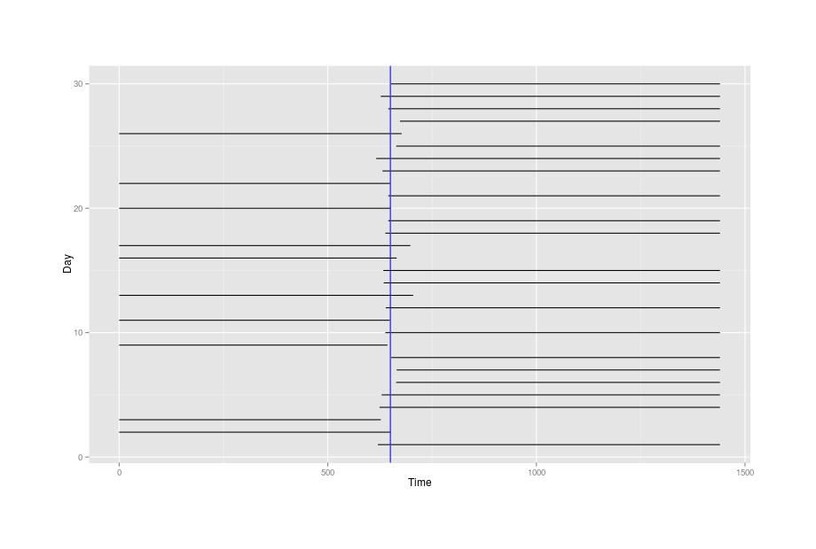
The simulated overlapping-intervals data, with the true mean time drawn in blue
And also with our simulated dataset, we can see if the standard R survival library and an interval-censored model written in JAGS can recover the 650:
library(survival)
surv <- Surv(mailSim$Time1, mailSim$Time2, type="interval2")
s <- survfit(surv ~ 1, data=mailSim); summary(s)
##  time   n.risk   n.event survival   std.err lower 95% CI upper 95% CI
##  625.5 30.0000 3.33599e+00 0.888800 0.0573976     0.783131     1.000000
##  641.0 26.6640 4.15541e+00 0.750287 0.0790267     0.610339     0.922323
##  647.0 22.5086 6.14506e+00 0.545451 0.0909091     0.393449     0.756178
##  651.5 16.3635 3.84506e-11 0.545451 0.0909091     0.393449     0.756178
##  664.5 16.3635 5.82315e-03 0.545257 0.0909124     0.393258     0.756005
##  675.0 16.3577 1.63577e+01 0.000000       NaN           NA           NA
plot(s)

png(file="~/wiki/doc/statistics/decision/mail-delivery/gwern-simulated-survivalcurve.png", width = 800, height = 500)
plot(s)
invisible(dev.off())
sr <- survreg(surv ~ 1, dist="gaussian", data=mailSim); summary(sr)
##                 Value Std. Error        z           p
##                 Value Std. Error        z           p
## (Intercept) 663.08028   9.742171 68.06289 0.00000e+00
## Log(scale)    3.41895   0.438366  7.79931 6.22465e-15
##
## Scale= 30.5374
##
## Gaussian distribution
## Loglik(model)= -15.8   Loglik(intercept only)= -15.8
## Number of Newton-Raphson Iterations: 11
## n= 30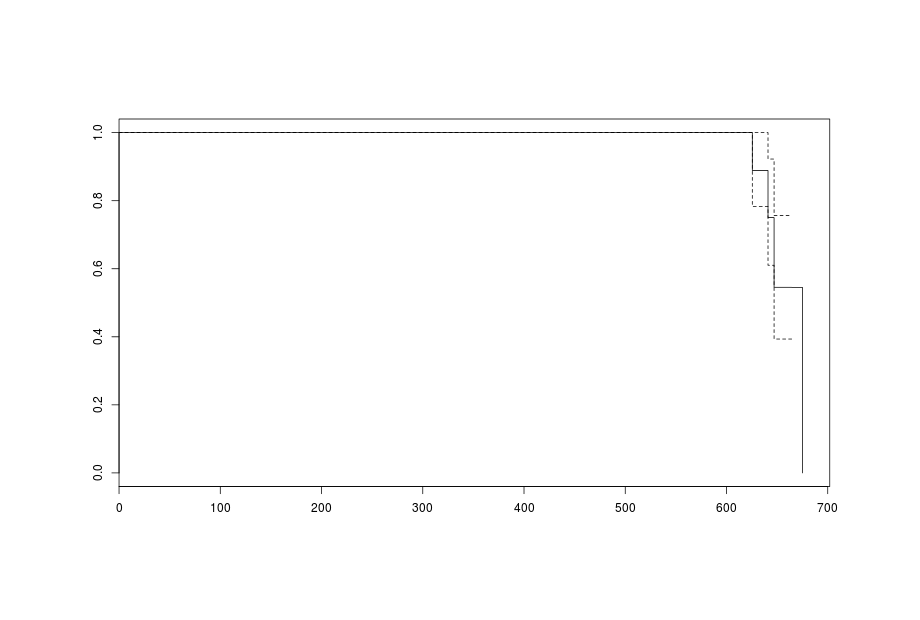
Survival curve (death=delivery)
More Bayesianly, we can write an interval-censoring model in JAGS, which gives us the opportunity to use an informative prior about the mean time the mailman comes.
They work normal 9-5 hours as far as I know, so we can rule out anything outside 540-1020. From past experience, I expect the mail to show up not before 10AM (600) and not after 1PM (780), with those extremes being rare and sometime around 11AM (650) being much more common; so not a uniform distribution over 600-780 but a normal one centered on 650 and then somewhat arbitrarily saying that 600-700 represent 3 SDs out from the mean of delivery times to get SD=~30 minutes so in all, dnorm(650, pow(30, -2)). The SD itself seems to me like it could range anywhere from a few minutes to an hour, but much beyond that is impossible (if the SD was over an hour, then every so often the mailman would have to come at 8AM! and if it was smaller than 10 minutes, then I would never have noticed much variation in the first place).
library(R2jags)
model1 <- function () {
    for (i in 1:n){
           y[i] ~ dinterval(t[i], dt[i,])
           t[i] ~ dnorm(mu,tau)
           }

           mu ~ dnorm(650, pow(30, -2))
           sd ~ dunif(10, 60)
           tau <- pow(1/sd, 2)

           y.new ~ dnorm(mu, tau)
    }
# y=1 == Event=3 for `Surv`: event is hidden inside interval, not observed/left-/right-censored
data <- list("dt"=mailSim, "n"=nrow(mailSim), "y"=rep(1, nrow(mailSim)))
inits <- function() { list(mu=rnorm(1),sd=30,t=as.vector(apply(mailSim,1,mean))) }
params <- c("mu", "sd", "y.new")
j1 <- jags(data,inits, params, model1); j1
##          mu.vect sd.vect    2.5%     25%     50%     75%   97.5%  Rhat n.eff
## mu       665.055   9.841 647.724 658.092 664.334 670.983 686.264 1.008   280
## sd        40.153  11.592  18.626  30.643  40.813  49.707  59.048 1.047    51
## y.new    664.103  42.908 577.518 637.561 663.011 689.912 749.936 1.002  1300
## deviance   0.000   0.000   0.000   0.000   0.000   0.000   0.000 1.000     1
Both approaches’ point-value mean time of 663-665 (11:03-11:05AM) come close to the true simulation value of 650 (11AM) and the prediction interval of 577-749 also sounds right, validating the models. The estimated standard deviation isn’t as accurate with a wide credible interval, reflecting that it’s a harder parameter to estimate and the estimate is still vague with only n = 30.
With a simulation and JAGS set up, we could also see how the posterior estimates of the mean, 95% CI of the mean, and predictive interval change as an additional datapoint is added:
animatePosteriors <- function (df, filename, upperTrue, lowerTrue) {
  # https://cran.r-project.org/web/packages/animation/index.html
  library(animation)
  saveGIF(
      for(n in 1:nrow(df)){
          data <- list("dt"=df[1:n,], "n"=nrow(df[1:n,]), "y"=rep(1, nrow(df[1:n,])))
          inits <- function() { list(mu=rnorm(1),sd=30,t=as.vector(apply(df[1:n,],1,mean))) }
          params <- c("mu","sd", "y.new")
          j1 <- jags(data, inits, params, model1, progress.bar="none")

          lowerMean <- j1$BUGSoutput$summary[c(2),][3]
          medianMean  <- j1$BUGSoutput$mean$mu
          upperMean <- j1$BUGSoutput$summary[c(2),][7]

          lowerPredictive <- j1$BUGSoutput$summary[c(4),][3]
          upperPredictive <- j1$BUGSoutput$summary[c(4),][7]

          ## WARNING: need an environment call for `ggplot` inside a function for local variables like
          ## 'n' to be visible: https://stackoverflow.com/a/29595312/329866
          ## WARNING: & you can't just call qplot due to animation/ggplot2 bug; have to assign & print
          timeLimits <- seq(from=9*60, to=12.8*60, by=15)
          p <- ggplot(df[1:n,], environment = environment()) +
                coord_cartesian(xlim = timeLimits) +
                scale_x_continuous(breaks=timeLimits, labels=sapply(timeLimits, toClock)) +
                ylab("Day") + xlab("Time") +
                geom_segment(aes(x=df[1:n,]$Time1, xend=df[1:n,]$Time2, y=1:n, yend=1:n)) +
                geom_vline(xintercept=medianMean, color="blue") +
                geom_vline(xintercept=lowerMean, color="green") +
                geom_vline(xintercept=upperMean, color="green") +
                geom_vline(xintercept=lowerPredictive, color="red") +
                geom_vline(xintercept=upperPredictive, color="red") +
                geom_vline(xintercept=lowerTrue, color="red4") +
                geom_vline(xintercept=upperTrue, color="red4")
          print(p)
          },
      interval = 0.7, ani.width = 800, ani.height=800,
      movie.name = filename) }

simData <- simulateMailbox(200, 650)
confintTrue <- round(qnorm(c(0.025, 0.975), mean=650, sd=30))
lowerPredictiveTrue <- confintTrue[1]
upperPredictiveTrue <- confintTrue[2]
animatePosteriors(simData, "/home/gwern/wiki/image/maildelivery/simulated-inferencesamplebysample.gif", lowerPredictiveTrue, upperPredictiveTrue)
Simulated data: posterior estimates of mail delivery times,
evolving sample by sample for 200 datapoints.
The
estimated mean time is in blue, 95% CI
around the mean time in green, and lines are 95% predictive intervals as to when
the delivery is made
Probably the most striking aspect of watching these summaries updated datum by datum, to me, is how the estimate of the mean homes in almost immediately on close to the true value (this isn’t due solely to the informative prior either, as with a completely uninformative dunif(0,1440) will zoom in within 4 or 5 datapoints as well, after some violent thrashing around). What happens is that the intervals initially look uninformative if the first two or three all turn out to be delivered/non-delivered and so the mean delivery time could still be anywhere from ~11:AM-midnight or vice-versa, but then as soon as even one needle falls the other way, then the mean suddenly snaps into tight focus and gets better from there. While I understand this abrupt transition in hindsight (only a tiny subset of values around the overlapping tips of the needles can yield the observed flip-flops of delivery/non-delivery, while a mean time far from the tips would yield a completely consistent dataset of all deliveries/non-deliveries), I didn’t expect this, simply reasoning that “one interval-censored datum seems very uninformative, so it must take many data to yield any sort of decent result for the mean & standard deviation and hence the predictions”. But, even as the mean becomes precisely estimated, the predictive interval—which is what, in the end, we really care about—remains obdurate and broad, because we assume the delivery time is generated by a normal distribution and so the predicted delivery times are the product of not just the mean but the standard deviation as well, and the standard deviation is hard to estimate (a 95% credible interval of 12-51!). Also in hindsight this is predictable as well, since the flip-flopping needles may be sensitive to the mean, but not to the spread of delivery-times; the data would not look much different than it does if the mailman could deliver anywhere from 8AM to 3PM—on early days she delivers a few hours before I check the mailbox around 11AM and on late days she delivers a few hours after.
These considerations also raise questions about statistical power/optimal experiment design: what are the best times to sample from interval-censored data in order to estimate as precisely as possible with a limited budget of samples? I searched for material on interval-censored data but didn’t find anything directly addressing my question. The flip-flops suggest that to estimate the mean, one should sample only at the current estimated mean, which maximizes the probability that there will be a net 50-50 split of delivery/non-delivery; but where should one sample for the SD as well?
mailInterval <- data.frame(
 Date=as.POSIXct(c( "2015-06-20 11:00AM", "2015-06-21 11:06AM", "2015-06-23 11:03AM",
                    "2015-06-24 11:05AM", "2015-06-25 11:00AM", "2015-06-26 10:56AM",
                    "2015-06-27 10:45AM", "2015-06-29 10:31AM", "2015-06-30 10:39AM", "2015-07-01 10:27AM",
                    "2015-07-02 10:47AM", "2015-07-03 10:27AM", "2015-07-04 10:54AM", "2015-07-05 10:55AM",
                    "2015-07-06 11:21AM", "2015-07-07 10:01AM", "2015-07-08 10:20AM", "2015-07-09 10:50AM",
                    "2015-07-10 11:10AM", "2015-07-11 11:12AM", "2015-07-13 11:05AM", "2015-07-14 11:14AM",
                    "2015-07-15 11:40AM", "2015-07-16 11:24AM", "2015-07-17 11:03AM", "2015-07-18 10:46AM",
                    "2015-07-20 11:05AM", "2015-07-21 10:56AM", "2015-07-22 11:00AM", "2015-07-23 11:17AM",
                    "2015-07-24 11:15AM", "2015-07-27 11:11AM", "2015-07-28 10:44AM", "2015-07-29 11:18AM",
                    "2015-07-30 11:08AM", "2015-07-31 10:44AM", "2015-08-01 11:25AM", "2015-08-03 10:45AM",
                    "2015-08-04 10:45AM", "2015-08-05 10:44AM", "2015-08-06 10:33AM", "2015-08-07 10:55AM",
                    "2015-08-10 11:09AM", "2015-08-11 11:16AM", "2015-08-12 11:14AM", "2015-08-13 11:10AM",
                    "2015-08-14 11:02AM", "2015-08-15 11:04AM", "2015-08-18 11:15AM", "2015-08-20 11:20AM",
                    "2015-08-22 11:46AM", "2015-08-23 11:04AM", "2015-08-24 10:56AM", "2015-08-25 10:26AM",
                    "2015-08-26 11:57AM", "2015-08-27 10:15AM", "2015-08-31 12:35PM", "2015-09-01 11:44AM",
                    "2015-09-02 10:54AM", "2015-09-03 10:29AM", "2015-09-04 10:08AM", "2015-09-05 10:45AM",
                    "2015-09-07 10:58AM", "2015-09-08 10:25AM", "2015-09-09 10:29AM", "2015-09-10 10:48AM",
                    "2015-09-16 11:22AM", "2015-09-17 11:06AM", "2015-09-18 11:22AM", "2015-09-19 11:12AM",
                    "2015-09-21 11:52AM", "2015-09-23 12:02PM", "2015-09-24 10:00AM", "2015-09-25 12:08PM",
                    "2015-09-26 10:59AM", "2015-09-28 10:57AM", "2015-09-29 10:52AM" ),
                   "EDT"),
 Delivered=c(FALSE, FALSE, TRUE, TRUE, TRUE, TRUE, TRUE, FALSE, TRUE, FALSE, TRUE, FALSE, FALSE,
             FALSE, TRUE, FALSE, FALSE, FALSE, TRUE, TRUE, FALSE, TRUE, TRUE, TRUE, TRUE, FALSE,
             FALSE, FALSE, TRUE, TRUE, TRUE, FALSE, TRUE, TRUE, FALSE, TRUE, TRUE, FALSE, TRUE,
             FALSE, FALSE, FALSE, FALSE, TRUE, TRUE, TRUE, TRUE, TRUE, FALSE, TRUE, TRUE, FALSE,
             FALSE, FALSE, TRUE, FALSE, TRUE, TRUE, FALSE, FALSE, FALSE, FALSE, FALSE, FALSE,
             FALSE, FALSE, TRUE, TRUE, TRUE, FALSE, TRUE, TRUE, FALSE, TRUE, TRUE, FALSE, TRUE))
mailInterval$Time <- fromClock(mailInterval$Date)
mail <- with(mailInterval, data.frame(Time1 = ifelse(Delivered, 0, Time),
                           Time2 = ifelse(Delivered,  Time, 1440)))

library(R2jags)
model1 <- function() { for (i in 1:n){
           y[i] ~ dinterval(t[i], dt[i,])
           t[i] ~ dnorm(mu,tau)
           }

           mu ~ dnorm(650, pow(30, -2))
           sd ~ dunif(10, 60)
           tau <- pow(1/sd, 2)

           y.new ~ dnorm(mu, tau)
           }
data <- list("dt"=mail, "n"=nrow(mail), "y"=rep(1, nrow(mail)))
inits <- function() { list(mu=rnorm(1),sd=30,t=as.vector(apply(mail,1,mean))) }
params <- c("mu","sd", "y.new")
j1 <- jags(data, inits, params, model1, n.iter=100000); j1
##          mu.vect sd.vect    2.5%     25%     50%     75%   97.5%  Rhat n.eff
## mu       658.173   4.468 649.098 655.469 658.156 660.943 666.797 1.001  3000
## sd        27.138   7.976  16.034  21.417  25.459  30.916  48.149 1.001  3000
## y.new    658.098  27.960 601.899 640.912 657.942 675.067 712.985 1.001  3000
## deviance   0.000   0.000   0.000   0.000   0.000   0.000   0.000 1.000     1

animatePosteriors(mail, "/home/gwern/wiki/image/maildelivery/real-inferencesamplebysample.gif", 0, 0)Because JAGS provides an interval-censored distribution in the form of dinterval() with a likelihood function, we can use MCMC for inverse inference (reasoning from data to the underlying process) But if it didn’t, I wouldn’t know how to write one down for it and then the MCMC wouldn’t work; but I was able to write a little simulation of how the underlying process of delivery-and-checking works, which, given a set of parameters, spits out simulated results generated by the process, which is probability or forward inference (reasoning from a version of an underlying process to see what it creates). This is a common situation: you can write a good simulation simply by describing how you think something works, but you can’t write a likelihood function.
ABC (exemplified in the fun example “Tiny Data, Approximate Bayesian Computation and the Socks of Karl Broman”; see also Wilkinson’s intro & summary statistics posts) is a remarkably simple and powerful idea which lets us take a forward simulation and use it to run backwards inference. (Reminds me a little of Solomonoff induction.) There’s an R package, of course which implements nice features & optimizations, but ABC is so simple we might as well write our own for transparency.
The simplest ABC goes like this: You sample possible parameters from your prior, feed the set of parameters into your simulation, and if the result is identical to your data, you save that set of parameters. At the end, you’re left with a bunch of sets and that’s your posterior distribution which you can look at the histograms of and calculate 95% densities etc.
So for the mail data, ABC goes like this:
simulateMailbox <- function(n, dTime, dSD) {
    deliveryTime <- round(rnorm(n, mean = dTime, sd = dSD))
    checkTime <- round(rnorm(n, mean = dTime, sd = dSD))
    simulates <- mapply(function (ck, dy) { if(ck>dy) { return(c(0,ck)) } else { return(c(ck,1440)) }},
                         checkTime, deliveryTime)
    return(data.frame(Time1=simulates[1,], Time2=simulates[2,])) }

# if both data-frames are sorted, comparison is easier
mailSorted <- mail[order(mail$Time1),]

mail_sim <- replicate(100000, {
    # mu ~ dnorm(650, 20)
    mu <- rnorm(n=1, mean=650, sd=20)
    # sd ~ dunif(10, 60)
    sd <- runif(n=1, min=10, max=60)

    newData <- simulateMailbox(nrow(mailSorted), mu, sd)
    newDataSorted <- newData[order(newData$Time1),]

    if (all(newDataSorted == mailSorted)) { return(c(Mu=mu, SD=sd)) }
   }
  )
results <- Filter(function(x) {!is.null(x)}, mail_sim)
results <- data.frame(t(sapply(results,c)))
summary(results)
The first thing to note is efficiency: I can get a reasonable number of samples in reasonable amount of time for n = 1-3, but at 4 datapoints, it becomes slow. There’s so many possible datasets when 4 checks are simulated that almost all get rejected because they are not identical to the real dataset and it takes millions of samples and hours to run. And this problem only gets worse for n = 5 and bigger.
To run ABC more efficiently, you relax the requirement that the simulated data == real data and instead accept the pair of parameters if the simulated data is ‘close enough’ in some sense to the real data, close in terms of some summary statistic (hopefully sufficient) like the mean. I don’t know what are the sufficient statistics for a set of interval-censored data, but I figure that if the means of the pairs of times are similar in both datasets, then they are probably close enough for ABC to work, so I can use that as a rejection tolerance; implementing that and playing around, it seems I can make the difference in means as tight as <1 while still running fast.
mail_abc <- function(samples) {
    results <- list()
    n <- 0
    while (n<samples) {

      # Priors:
      ## mu ~ dnorm(650, 20)
      mu <- rnorm(n=1, mean=650, sd=20)
      ## sd ~ dunif(10, 60)
      sd <- runif(n=1, min=10, max=60)

      # generate new data set based on a pair of possible parameters:
      newData <- simulateMailbox(nrow(mail), mu, sd)

      # see if some summaries of the new data were within tolerance e<1 of the real data:
      if (abs(mean(newData$Time1) - mean(mail$Time1)) < 1 &&
          abs(mean(newData$Time2) - mean(mail$Time2)) < 1)
        { results <- list(c(Mu=mu, SD=sd), results); n <- n+1; }
    }
   return(results)
  }
sims <- mail_abc(2000)
results <- matrix(unlist(sims), ncol=2, byrow=TRUE)
summary(results)
##        V1                 V2
##  Min.   :600.5387   Min.   :10.56221
##  1st Qu.:639.2910   1st Qu.:22.79056
##  Median :644.7196   Median :26.33946
##  Mean   :648.4296   Mean   :26.98299
##  3rd Qu.:661.2050   3rd Qu.:30.38428
##  Max.   :716.9134   Max.   :55.80602
The mean value here is off somewhat from JAGS but still acceptable.
Another way to summarize the dataset occurs to me while looking at the graphs: the most striking visual feature of the interval-censored data is how the ‘needles’ overlap slightly and it is this slight overlap which determines where the mean is; the most informative set of data would be balanced exactly between needles that fall to the left and needles that fall to the right, leaving as little room as possible for the mean to ‘escape’ out into the wider intervals and be uncertain. (Imagine a set of data where all the needles fall to the left, because I only checked the mail at 2PM; I would then be extremely certain that the mail is not delivered after 2PM but I would have little more idea than when I started about when the mail is actually delivered in the morning and my posterior would repeat the prior.) So I could use the count of left or right intervals (it doesn’t matter if I use sum(Time1 == 0) or sum(Time2 == 1440) since they are mutually exclusive) as the summary statistic.
mail_abc <- function(samples) {
    results <- list()
    n <- 0
    while (n<samples) {

      # Priors:
      ## mu ~ dnorm(650, 20)
      mu <- rnorm(n=1, mean=650, sd=20)
      ## sd ~ dunif(10, 60)
      sd <- runif(n=1, min=10, max=60)

      # generate new data set based on a pair of possible parameters:
      newData <- simulateMailbox(nrow(mail), mu, sd)

      # see if a summary of the new data matches the old:
      if (sum(mail$Time1 == 0) == sum(newData$Time1 == 0))
        { results <- list(c(Mu=mu, SD=sd), results); n <- n+1; }
    }
   return(results)
  }
sims <- mail_abc(20000)
results <- matrix(unlist(sims), ncol=2, byrow=TRUE)
summary(results)
##        V1                 V2
##  Min.   :567.5387   Min.   :10.00090
##  1st Qu.:636.6108   1st Qu.:22.70875
##  Median :650.0038   Median :34.96424
##  Mean   :650.1095   Mean   :35.08481
##  3rd Qu.:663.7611   3rd Qu.:47.60481
##  Max.   :735.4072   Max.   :59.99941
This one yields the same mean, but a higher SD (which is more divergent from the JAGS estimate as well). So perhaps not as good.