Recently on the Business of Software forums I gave someone advice regarding web design. (I seriously, seriously envy his design prowess — the website for his VST host software is one of the best I have ever seen for a microISV.) One issue I identified with his site was that at some points it lacked clear direction as to what to do next.
On reflection, there is a gaping hole in my own site design for this: the big screenshot on the front page. It is ginormous and consistently picks up over 10% of the clicks on the page. Clicking on it currently brings up a maximized version of the screenshot in a lightbox. The lightbox is a wonderful effect, but what is the user supposed to do with the maximized version?
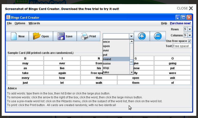
Well, ideally, they’re supposed to close that screenshot, then find the Free Trial or Try Online buttons and download. Blech! That is two more clicks, bringing to three the total of clicks they have made to my page! Clearly, there is an opportunity to eliminate a click. All I need to do is bring the buttons to them, in the constrained environment of the lightbox. (I’ve always wanted to do this but didn’t have any convenient way to do it with my previous lightbox technology, and never got around to doing it after moving to a less constrained lightbox script.)

I have pushed the new and improved version of the page live. If this post was published recently, you can see the old version here. For obvious usability wins like this one, I’m not going to bother A/B testing prior to pushing it live. (Plus I have a lot on my plate tomorrow in terms of non-obvious things, and running multivariate testing scares me.)
Today after reading a thread or three and watching a Google-produced movie about landing page optimization (over an hour long and worth your time) I was inspired to make some changes to my site. Recently I have been doing far more development than A/B testing, and truth be known I don’t really, um, know how my funnel is working these days. So I went back into the archives of my CrazyEgg tests and looked around to see if there was anything that jumped out at me. The fresh look caused me to pick up on a few things:
[Edited to add: My campaign returned to mostly normal on August 4th or thereabouts. I still don’t know what the heck happened, but I’m happy things are normal. I sent Google a second support request, but that may or may not have had anything to do with the fixing: it was not responded to. I also added two additional ads (which both triggered a human review), upped my bids, and in general tried to flag the system to say “Hey system, new stuff here!”, so that may or may not have had something to do with it. My current feelings about Google, on a 1 to 10 scale: performance of platform: 8, superiority over competing ad options: 10, support responsiveness: 3. That 3 is generous, based on my completely unevidenced thought that it is possible someone inside Google actually saw the problem and intervened. At the moment, though, I have as convincing evidence for the existence of Google technical support as I have evidence for the existence of Santa Claus — luckily for Google, in my heart of hearts, I still believe in Santa Claus.]